01/06Look at every theme before buying
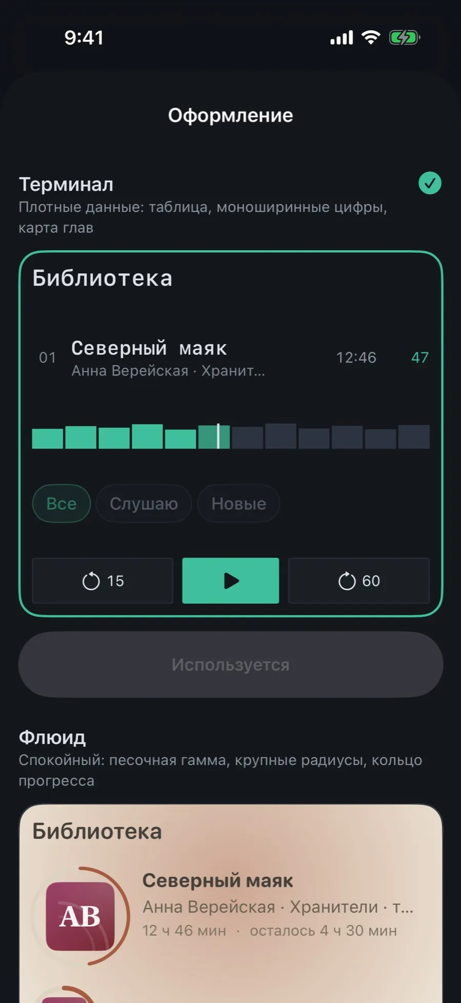
The gallery shows not name plates but a live piece of the app in each theme: the book list, the chips, the player buttons.
- Open Settings → “Appearance” → “Theme”.
- Scroll: each theme carries a name, a description and a working preview.
- Terminal is dense data: a table, monospaced figures, a chapter map.
- Fluid is the calm one: sandy colours, generous corners, a progress ring.
- The theme in use has its button at the bottom labelled “In use”.
The preview is not a picture: it is built from the real elements of the theme and changes along with them.
02/06Switch the theme
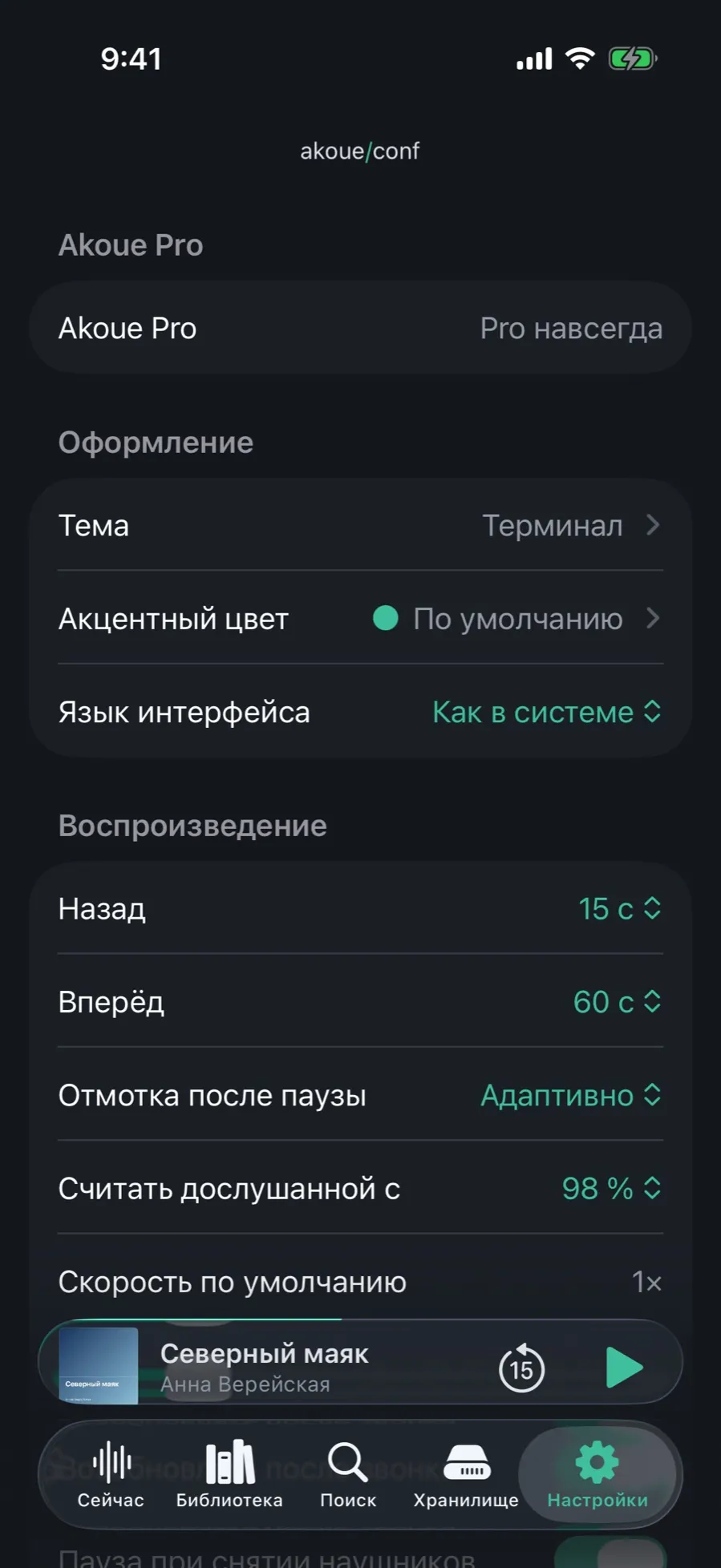
Theme, accent colour and interface language sit in one section of the settings.
- Open Settings. The “Appearance” section sits right under the Pro row.
- Tap “Theme” — the current one is shown on the right.
- Pick a theme in the gallery. The interface redraws at once, without a restart.
- Right there is “Interface language”: five languages or “Same as the system”. The language takes effect at the next launch.
A theme is a device setting: you can keep one on the iPad and another on the iPhone.
03/06Pick an accent colour
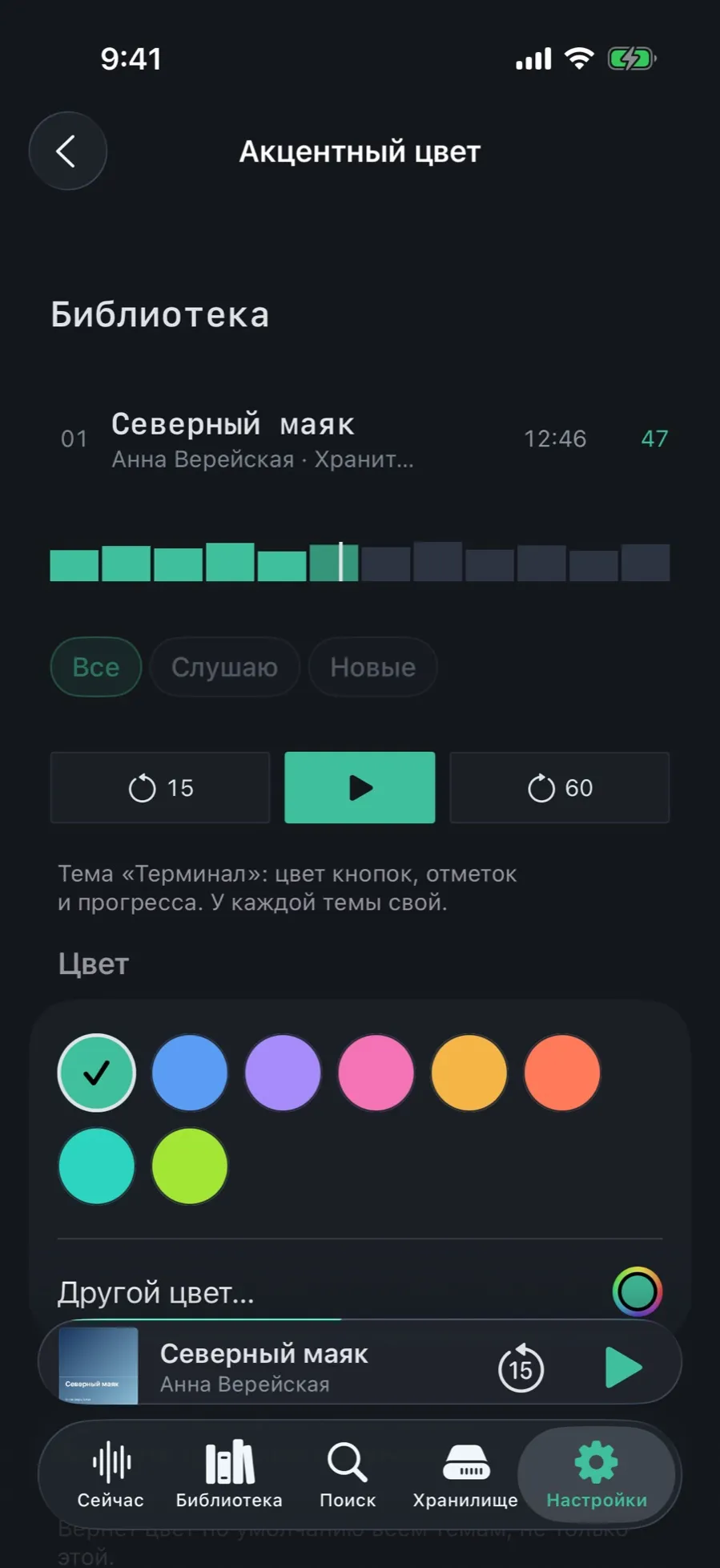
The accent is the colour of buttons, marks and progress. Every theme has its own, and unreadable combinations do not happen: the contrast is worked out for you.
- Open Settings → “Appearance” → “Accent colour”.
- At the top is a live preview: the list, the chips and the player buttons in the chosen colour.
- The “Colour” section holds the presets for this theme. The chosen one is ringed with a check mark.
- Want your own — tap “Other colour…” and take any from the system picker.
- The reset button at the bottom of the screen brings back the theme’s own colour.
The accent colour belongs to Pro, like the themes themselves. Without it the row stays visible and explained, but locked.
04/06Fluid: the same, only calmer
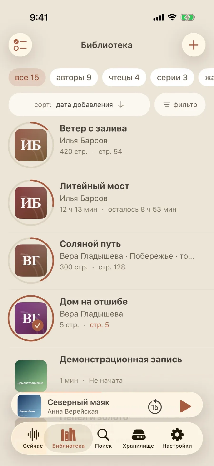
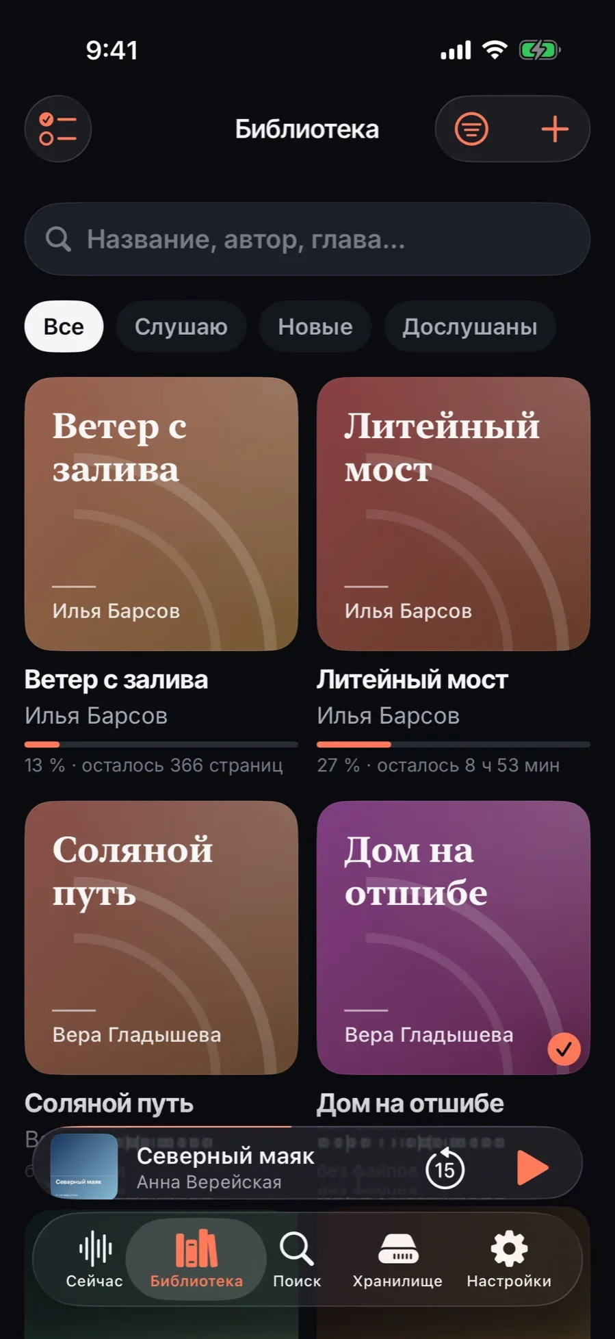
The same library, the same book, the same data — laid out differently. Big covers, progress as a ring, figures that are not squeezed into columns.
- Compare with the Terminal list: there a table with “length” and “%” columns, here rows with covers and a human “8 h 53 min left”.
- The grouping strip carries counts: “all 15”, “authors 9”, “narrators 4”, “series 3”.
- Sorting and filtering are buttons on the screen rather than items hidden in a menu.
05/06Tape: paper and a counter
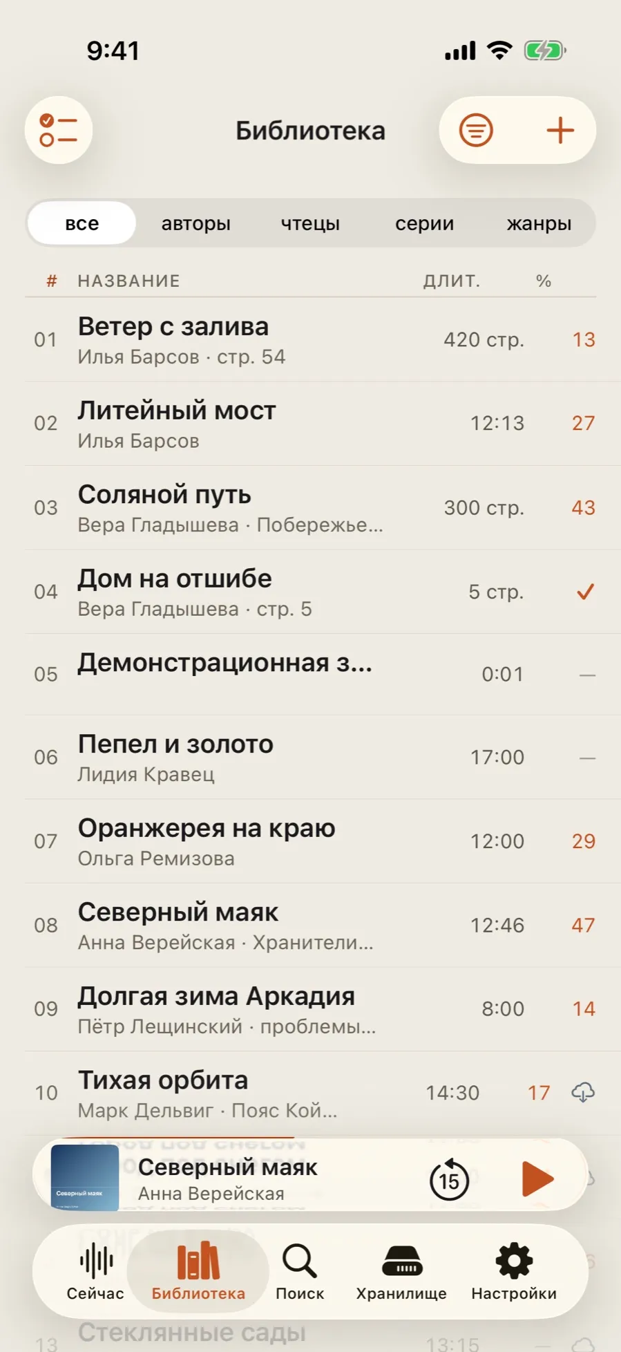
A light theme on a paper ground with an orange accent. The density of Terminal, a different mood.
- The list stays a table with columns, but the figures are no longer monospaced.
- The default accent is orange; it changes in the same place as for any theme.
- The mini player and the tab bar take the same paper ground.
06/06Aura: glass lit by the cover
A dark theme where the background is drawn from the colours of the current book’s cover and the panels are made of glass.
- Aura’s home screen is a hero: the current book takes the top of the screen with a full-width cover.
- On the Now tab, next to Continue, there is a bookmark button: drop a mark without opening the player.
- Everything else is the same library with the same sort orders and filters.
What themes do not do
- Themes of your own: the set of four is fixed, and an outside one cannot be loaded.
- A separate light-or-dark switch: the lightness comes from the theme itself, not from the system setting.
- Syncing the appearance between devices: the theme and the accent colour stay on the device where they were chosen.