Four themes
A theme changes the shape of the interface, not the set of capabilities. The same library, the same book — laid out differently.
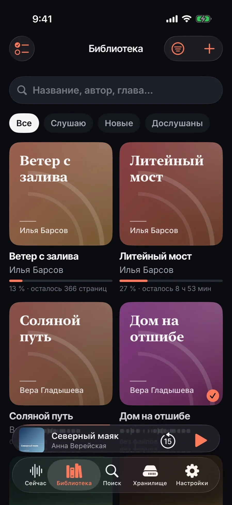
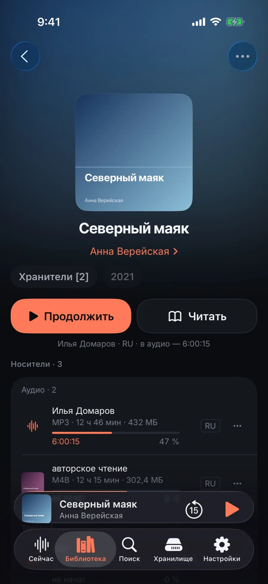
Every screenshot below was taken on the same demo library and the same book. The only difference between them is the theme: the density of the data, the shape of the list, the corners, the colour and how the home screen is built.
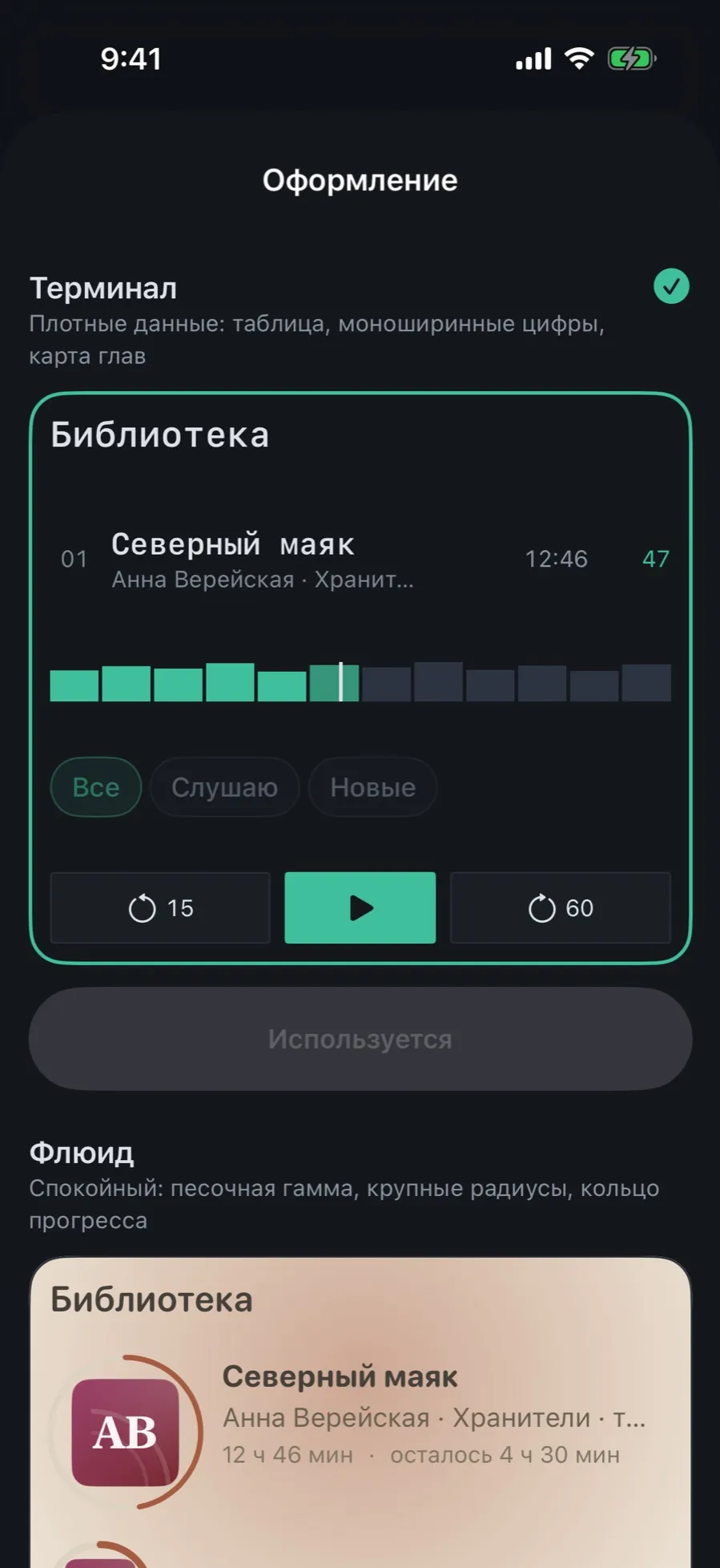
Terminal is free and set by default. Fluid, Tape and Aura come with Pro — but the theme gallery with its live preview is open to everyone, so you can look before you buy.
Terminal
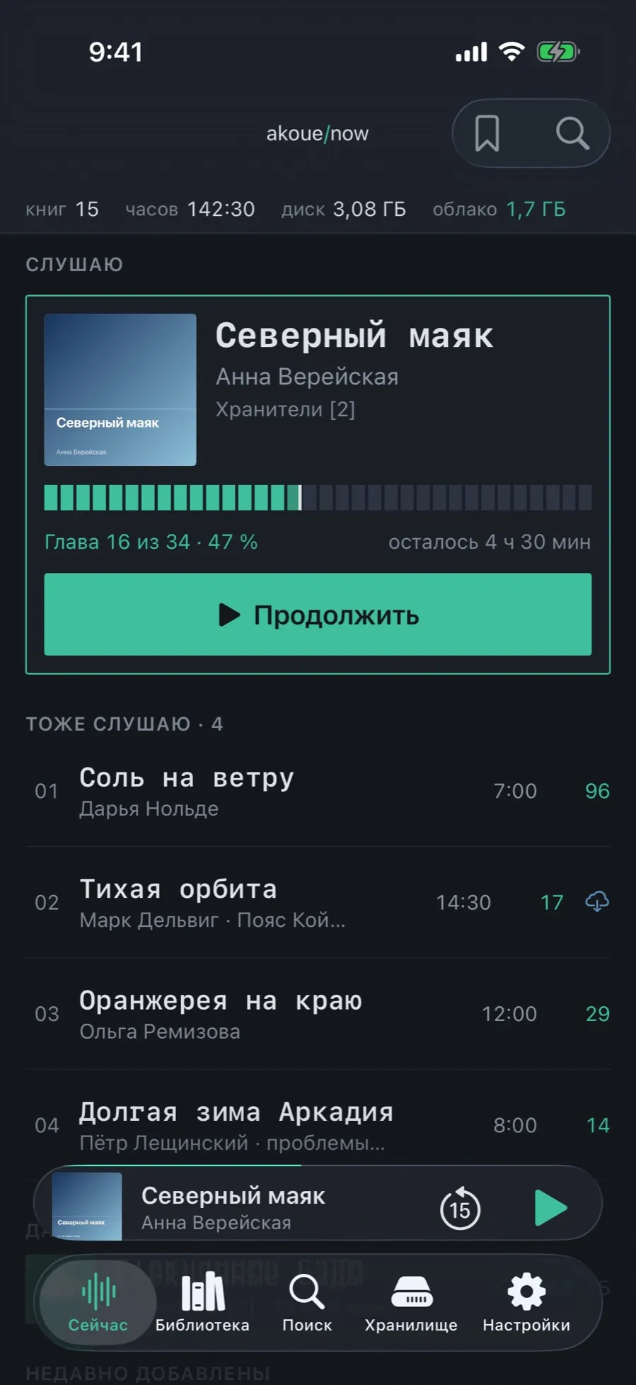
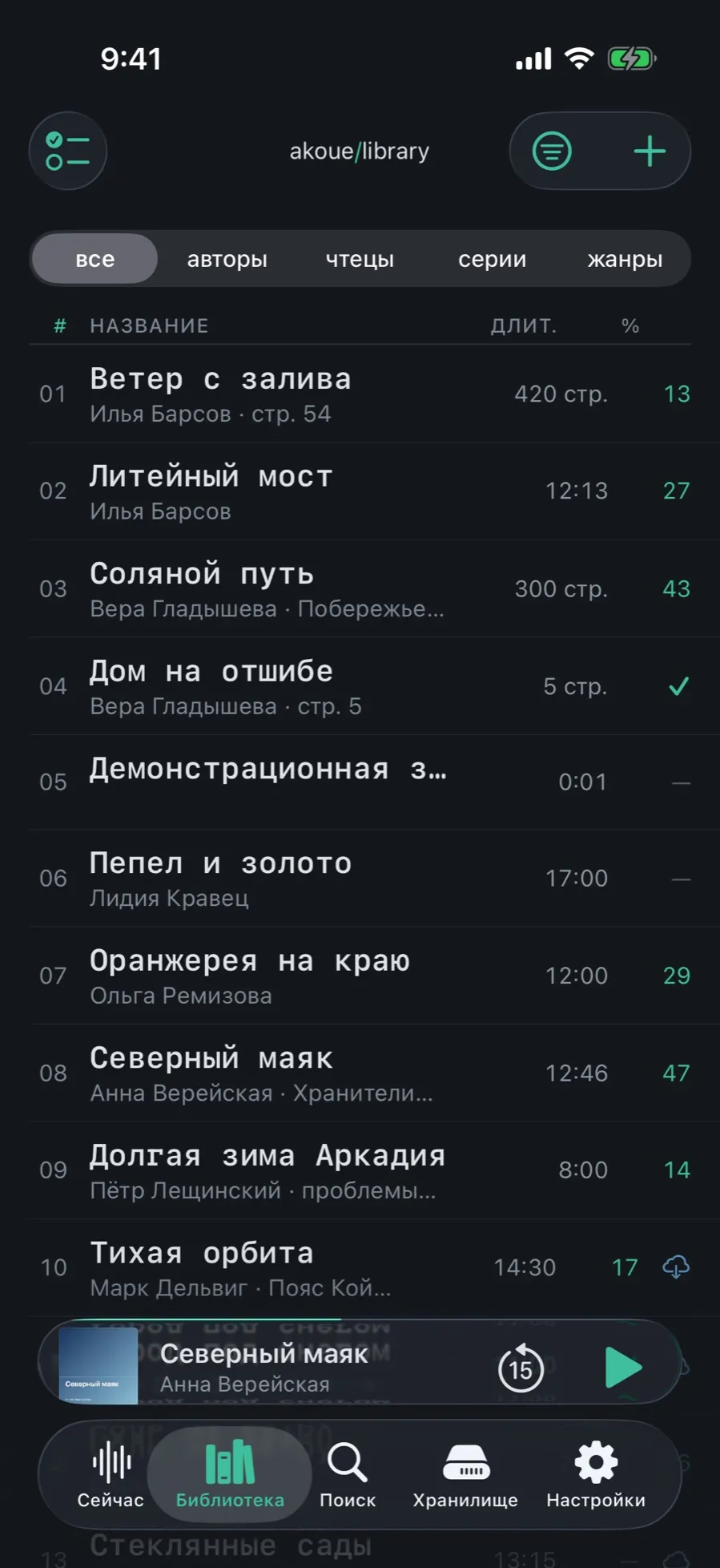
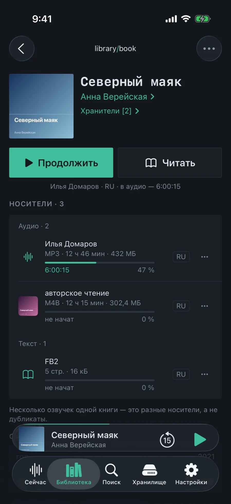
dense data, a table, monospaced figures, a chapter map
The densest of the four: books stand in a table with columns for length and per cent, the figures are monospaced and line up in a column, and a book’s progress is shown as a chapter map — one block per chapter. The Now screen opens with the library’s status line: how many books, how many hours, how much is taken on the device and in the cloud.
Fluid
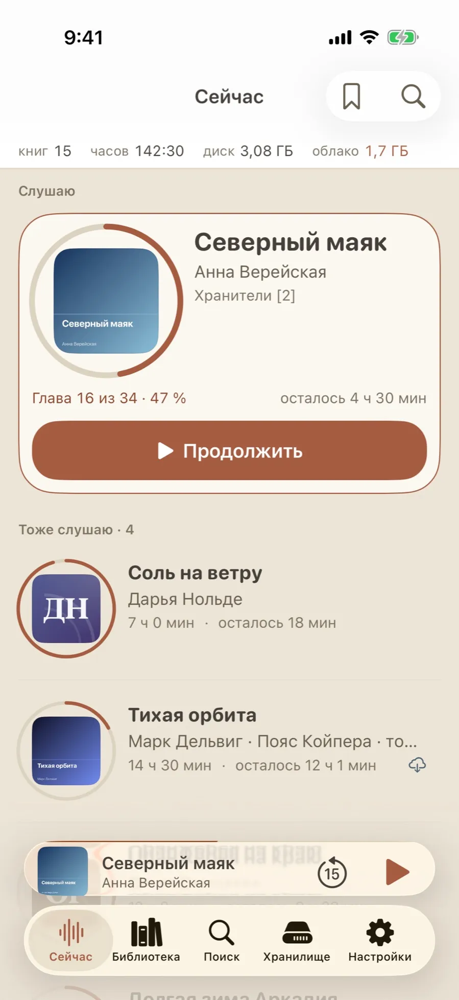
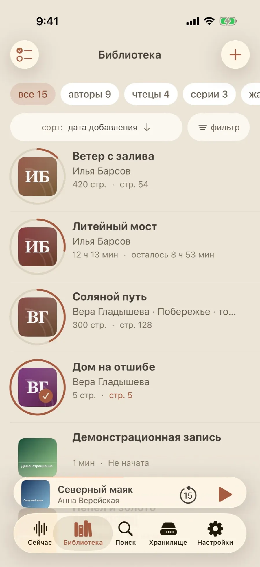
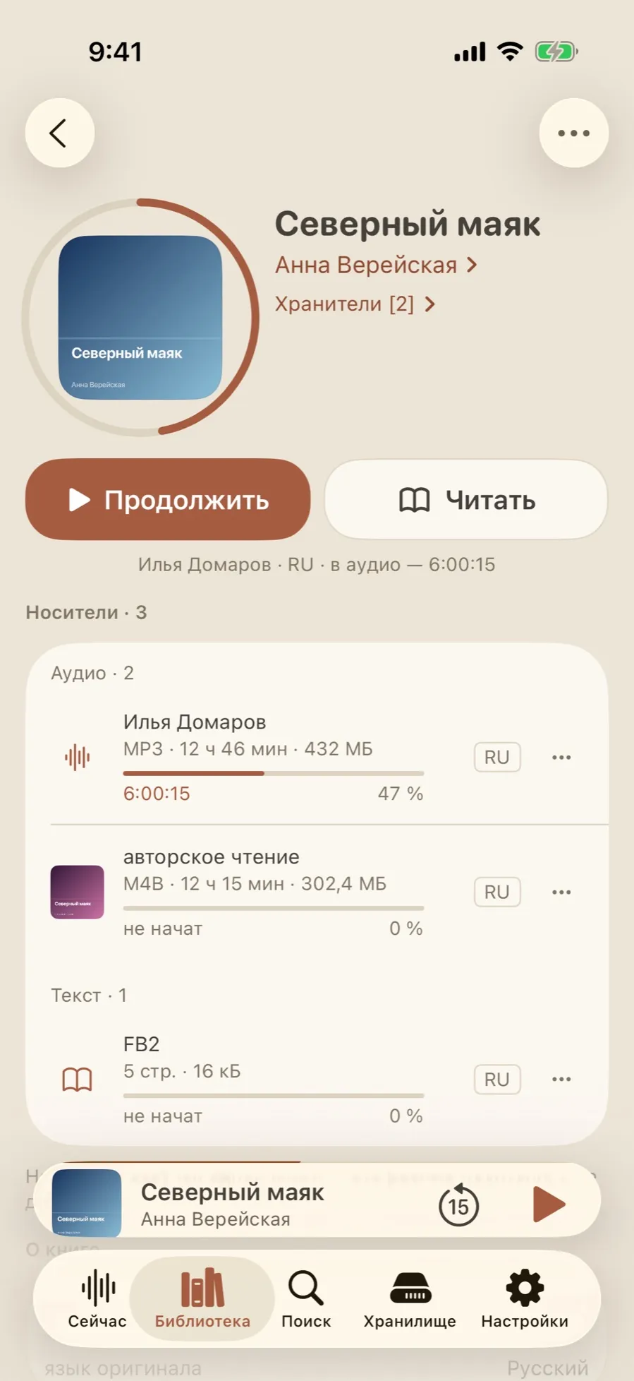
calm: sandy colours, generous corners, a progress ring
The same library, laid out with more room: rows with round covers, progress as a ring around the cover, and instead of a per-cent column a human “8 h 53 min left”. Sorting and filtering are buttons on the screen rather than items hidden in a menu.
Tape
paper, reels, a counter
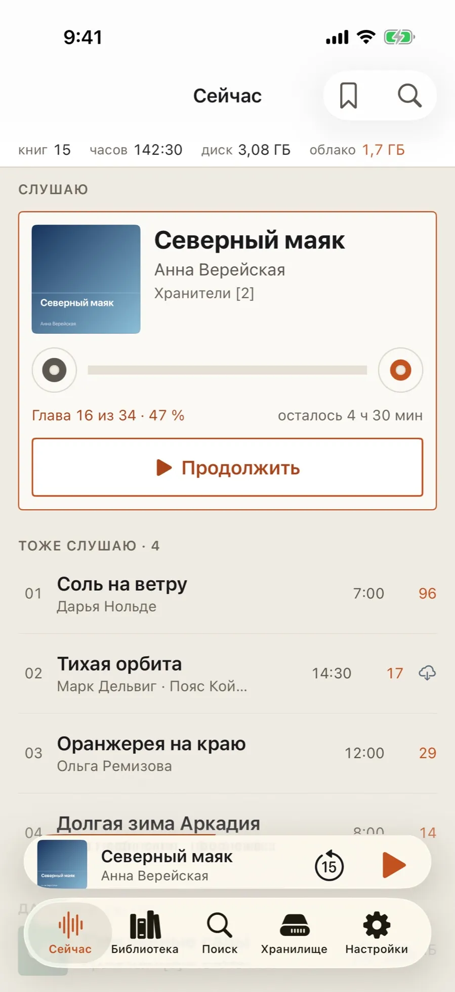
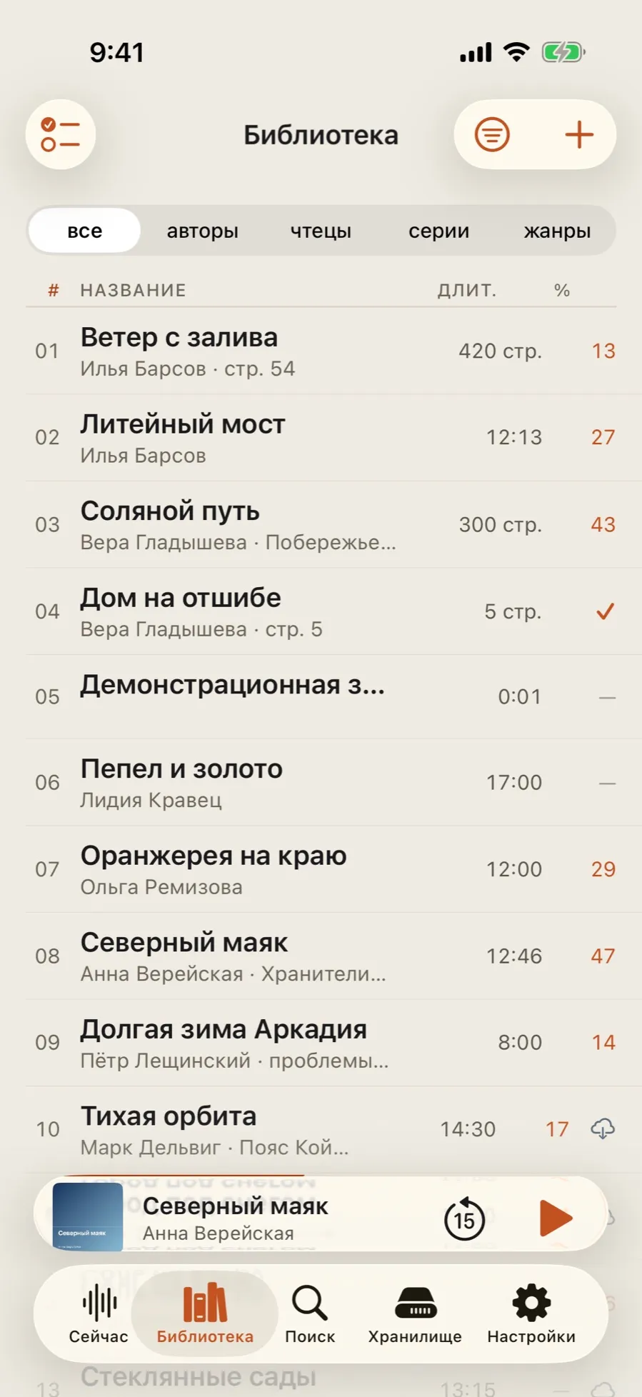
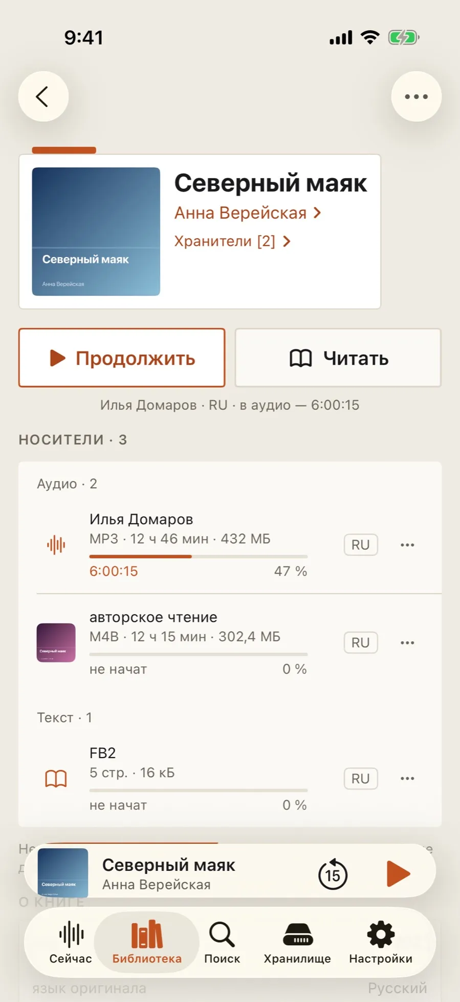
A light theme on a paper ground with an orange accent. The density of Terminal — the same table with columns — but the figures are set in the ordinary face and the panels are softer. The mini player and the tab bar pick up the same paper.
Aura
glass lit by the cover
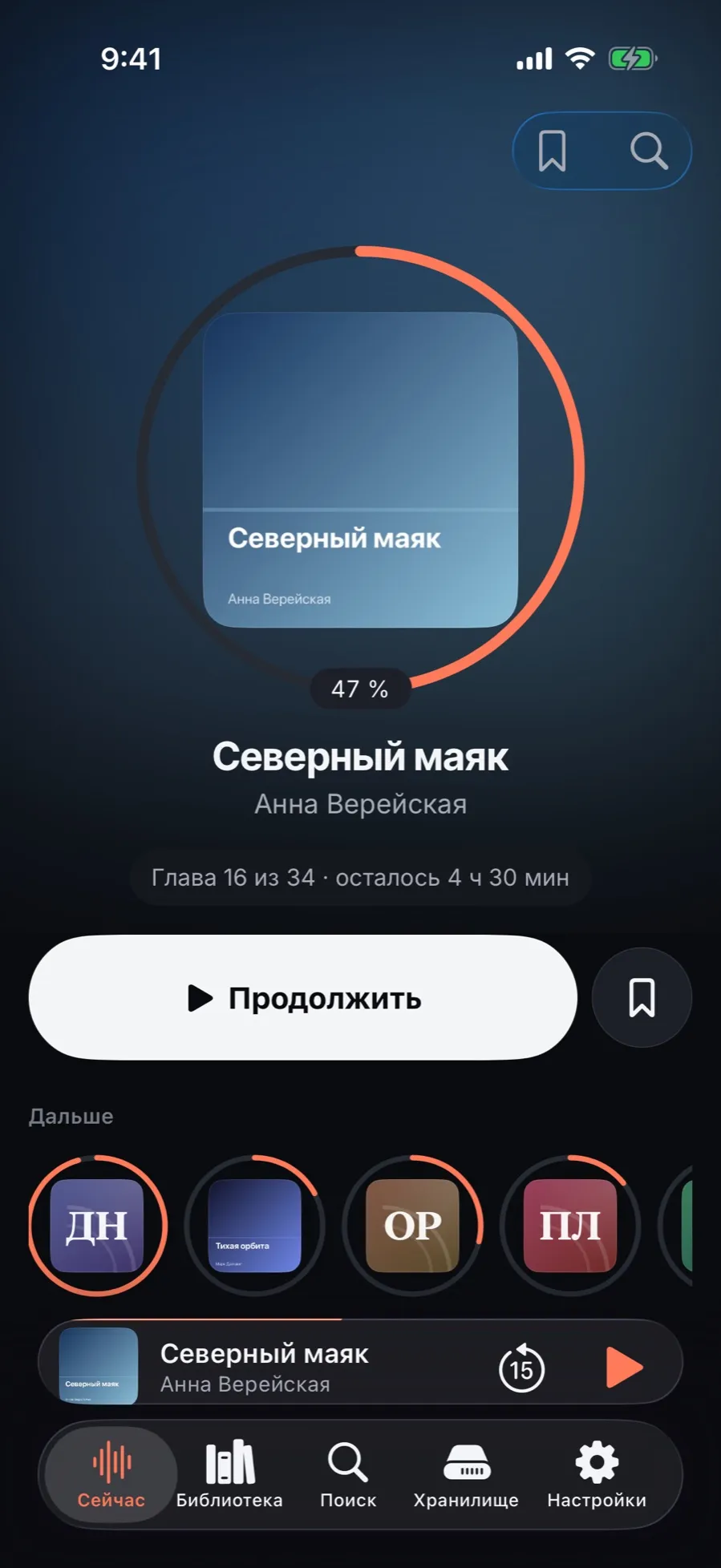
A dark theme where the background is drawn from the colours of the current book’s cover and the panels are made of glass. The home screen here is a hero: the current book shows as a large cover inside a progress ring, and next to Continue sits a bookmark button — drop a mark without opening the player.
How to switch and set the colour
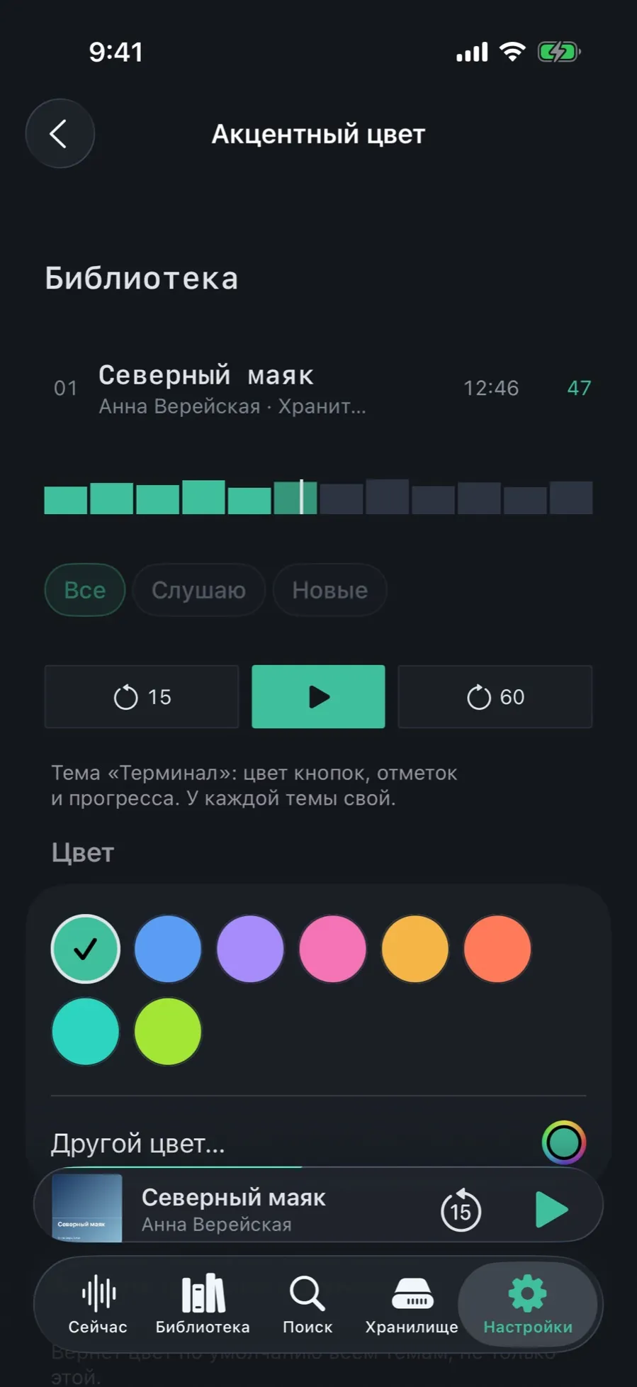
The theme is changed in Settings → Appearance → Theme: the gallery shows not name plates but a working piece of the app in each theme. Next to it, Accent colour — the colour of buttons, marks and progress, separate for every theme. Unreadable combinations do not happen: the contrast is worked out for you.